
Interactive ‘Mystery Curve’ using Jupyter notebook
June 4th, 2015
| Categories: just for fun, programming, python, Scientific Software, tutorials
| Tags:
The ever-superb John D. Cook recently found this lovely looking curve in a book he’s currently reading
John posted some Python code that reproduced this curve. I stole borrowed his code, put it in a Jupyter notebook and wrapped it in an interactive widget to allow me to play with the parameters and see what other curves I could come up with. The result looks like this.
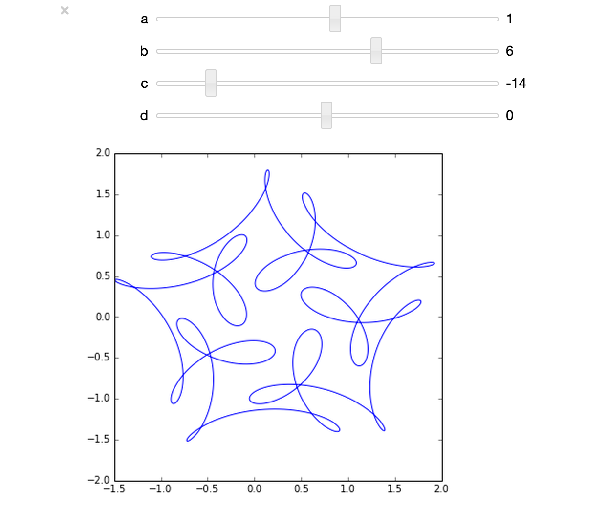
If you’d like something where those sliders work, you need to run the notebook I’ve created in Project Jupyter. Here are 2 ways to do that.
- Download the notebook from github
- Method 1: Upload this notebook to Try Jupyter.
- Method 2: Install Anaconda Python on your machine. Launch the notebook and open the file downloaded above.
Once you have the notebook open, click on Cell->Run All and play with the sliders that pop up.
Other posts about these curves:
- Random cyclic curves – Includes code written in Haskell
- A geogebra applet
Interesting function! The interactive widgets are also pretty cool. Found them useful when doing rough and ready model sensitivity analysis.
There is Maple source code for producing interactive applications for this topic, using the Explore command, here:
http://www.mapleprimes.com/posts/200943-Hypotrochoids-And-Symmetric-Things